
“Design is change without risk.”
Category: Design Page 1 of 2
As a general partner of Brainwash Movies, which has been the case for a couple years, I am involved in pretty much everything that goes on surrounding the 16th Annual Brainwash Drive-in Bike-in Walk-in Movie Festival in Oakland. It’s fun and very unique; everyone who can go should go!
Just in the last several months, we have viewed over 80 submissions of mostly short, sometimes weird, always independent movies, totaling 30 hours. We judged those movies in June and chose 4 1/2 hours (22 shorts and one feature) to show on August 7, 13, and 14. It could be our best show yet (but I say that every year). I was one of three people to decide which movies to show and which order to show them in. I also laid out the initial version of our printed program and promotional flyer. Next I need to do major updates to the website and our Facebook page (so far, I’ve just scratched the surface).
Also, the San Francisco Improv Festival (headed up by the awesome folks what brought you Crisis Hopkins) hired me to set up WordPress on their brand-new site and to convert someone else’s design to a WordPress theme. I did so and it went well. I plan to continue to do improvements on their site, assuming they don’t think my rates are exorbitant (which they really aren’t).
This on top of a ridiculous amount of work at CLCV (including a big website redesign that will launch sometime this summer) and trying to take some time for myself (including a very nice but too brief 8-day vacation in Milwaukee & Chicago). One of these days I’ll post a bunch of shots on my flickr page (stay tuned).
That’s the update — check out Brainwash and SFIF in August! It’ll be more than worth your time and the very reasonable cost of admission.
I figured I should break each session into its own blog entry. It’s going to take a little time to finish all of them since some of my notes are on the iPhone (since emailed to self) and the rest are on paper (starting the moment the phone died).
Here’s a random sampling of what I learned during Tim Ferriss‘s session at WordCamp San Francisco 2009, today at UCSF Mission Bay.
Tim Ferriss’s tips on blogging and SEO:
- Don’t call your categories “Categories.” Call them “Topics.” They’ll get clicked on a lot more.
- Don’t put your all-time most popular posts on your home page, because they will just stay your all-time more popular posts. Show your most popular posts from the last 30 days (rolling).
- Publishing your twitter feed with a link to twitter results in a mass exodus, especially for new users.
- If you are monetizing, RSS is less and less relevant especially with microblogging tools.
- if you come from an outside link to his site, the date on older posts is de-emphasized, because new users are biased towards fresher content. I think that’s what he said.
- Consider including “total read time” on each of your posts (using 250 words per minute as the standard for estimating)
- Being a good writer is less important than finding your own voice. Tim says that Mark Cuban says to write about what you’re passionate about.
- People are bad at predicting what they’re going to like.
- Figure out when your best synthesis time is, and write then. Tim (a Princeton man) has a glass of wine and some yerba mate. YMMV. My Wisconsin roots make my approximation of that a beer and a cup of coffee.
- For important posts, edit by hand. Cut 20% of the word count each time.
- Ignore SEO in the first draft of any blog posts. (I do this mainly because I ignore SEO all the time). Use the Google keyword tool to find out what other phrases you should be including in your post.
- Ensure that posts can only be described one way (that is, keep each post on one topic). Why? So that when people link to any given post, they are using the same words to describe it. Bingo.
- When you’re making video for the web, the amount of time you spend on it is NOT proportional to its future success. Sometimes the quickest, most spontaneous stuff gets the most attention. Alongside the video, include “bonus” content (so that it’s indexable). This is some brilliant stuff that should be obvious.
- Stumbleupon is a cheap source of high quality traffic.
- Don’t be too topical. Don’t chase the news. That’s boring.
- Tim blogs in short, long, and micro form. Different sites for different forms.
- This was probably the most important thing he said: “Think big but play often. Take fun seriously!” Your blog should not be a source of stress.
- “Trying to please every stranger in the world is the path to misery.”-Tim Ferriss
- “If you’re having fun, you’re not wasting time — you’re not being productive, but you’re not wasting time.”
There’s a lot there.
Okay, sure, all this stuff is old news. But someone might not know.
Anyway, I was just pointed to atom.smasher.org, home of the Error Message Generator, Street Party Sign Generator, Highway Sign Generator, Gas Station Sign Generator, etc. The Wheel of Fortune puzzle generator is particularly amusing.
It’s similar to says-it.com, which I already knew about (where you can generate church signs, movie marquees, vinyl records, bank signs, football jerseys, etc.), but different.
The humor potential is limitless. Also, we’re doomed.
I’m trying to redesign my portfolio and keep this website up to date. But the code has been revised and iterated continuously since 2001. This site at least is in XHTML and uses CSS for layout. So that’s good. But I’m using Tantek Çelik’s Box Model Hack, and frankly, it makes my CSS ugly and adds extra complications that may not be needed.
But every time I look up info on the Box Model Hack via Google, I get all kinds of results from 2005 (see above). Web design and coding have changed a lot in the ensuing three years, and all I want to know is if I should still be using it. (Luckily, somehow I completely missed the Holly Hack.)
So, at lunch at WordCamp 2008 on Saturday, I button-holed Tantek Çelik himself (the person who devised the Box Model Hack) to ask whether or not I should still be using it. He answered with a question — to paraphrase, “Does your site still need to work in IE 5 for Windows?”
So the answer on the Box Model Hack for 2008 is this: If your site still needs to work in IE 5 for Windows (the version of IE that has a broken box model), then you should still be using the Box Model Hack. If it doesn’t, then you don’t.
And it looks like 98.2% of those people browsing my work site in Internet Explorer, which is the most common browser family used to peruse ecovote.org, are using either IE 6.0 or 7.0. So I think I can get rid of it there.
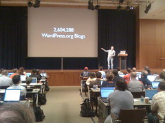
WordCamp 2008 happened on Saturday in San Francisco, and it was good.
Highlights were many and often. In no particular order:
Liz Danzico and Jane Wells talked about the great usability work they’re doing for WordPress, and showed off some of the modifications they may or may not make to the current WordPress interface.
Tantek Çelik talked about microformats (and I got to ask him about the box model hack – more on that later).
Stephen Spencer (of NetConcepts, of Madison) provided some interesting tips on search engine optimization that were new to me.
Kathy Sierra (who writes books about Java) gave an amazing presentation that turned my ideas about designing websites upside down. Really! She started out with a trick question: Which testimonial is better: a. “This company kicks ass” or b. “This product kicks ass”? The answer, of course, is c. “I am awesome.” The basic question anyone who makes anything should be asking is, “how can my product make my users be able to kick ass?”
The LOLcats guy, Ben Huh, was there talking about “viral virility”! He made lots of good points that were perhaps overshadowed by the lolcats that illustrated his presentation and distracted everyone with their hilarity.
And of course Matt Mullenweg, founder of WordPress and Automattic, noted that the State of the Word is strong.
(Incidentally, Matt noted that he wants to be the #1 Matt on the web again. [He used to be until some guy who dances for gum, uh, whose site I actually like, took over.] So I’m indulging his wishes by linking to Matt here.)
For way more details, read Andrew Mager’s liveblog of WordCamp 2008. He was one of the people I actually talked to there… a really cool guy who happened to be at Virginia Tech last year and created a powerful community site. He was also the unofficial conference mascot once he applied a temporary WordPress tattoo to his forehead.
Here are a couple of my WordCamp photos (more later).
Note on location: It was held at the Mission Bay Conference Center on the weirdly isolated UCSF campus. (Biking in from BART, it was almost impossible to figure out which building was the conference center… I figured it was the biggest building I could see, and I happened to be right, but none of the permanent campus signage indicated where it was! One would figure that the most people coming to conferences on campus would be the people least likely to know the campus — so why wouldn’t they put the conference center on the permanent maps? Unfathomable.
But overall WordCamp 2008 was a real improvement on WordCamp 2007 (which I also thoroughly enjoyed). The venue was more comfortable in almost every way. Last year, at the Swedish-American Hall, it was really hot, there was no room for all the livebloggers attached to their laptops, there was only one track of talks. This year, the venue (and the food!) was way better and the vast majority of the speakers were informative and interesting.
A Brief Message dot com features design opinions expressed in short form—200 words or less.
“Robert Rauschenberg, dubbed by the New York Times as a “Titan of American Art,” has died, aged 82.
I grew up seeing his work over and over again, and it has had a subtle but lasting impression on me. He was a master of capturing the energy and imagery of the mid- to late-20th century.
Very much of interest (to me, at least): 2007 logo design trends.

“The Road to Clarity”, on nytimes.com, relates the story of the development of Clearview, the newish font system designed to improve the legibility of America’s highway signs.
Though it appears to me that adoption has been slow (have you seen this typeface on highway signs? Maybe I’m just hardly ever on the highway), it makes me happy that
- someone competent is designing typefaces for highway signs, and
- someone is writing about it in the New York Times.